First of all I am sorry for not posting anything for a while. I haven’t had time, effort and, or, motivation to write here. So it’s been three weeks since I last posted here. But, now it’s time for me to write something for you guys. As you may have noticed I have added some advertisements to this blog. Maybe I get something out of this. I don’t know and we’ll figure out as I keep writing these stories here. I am trying to write something at least once in two weeks or so.
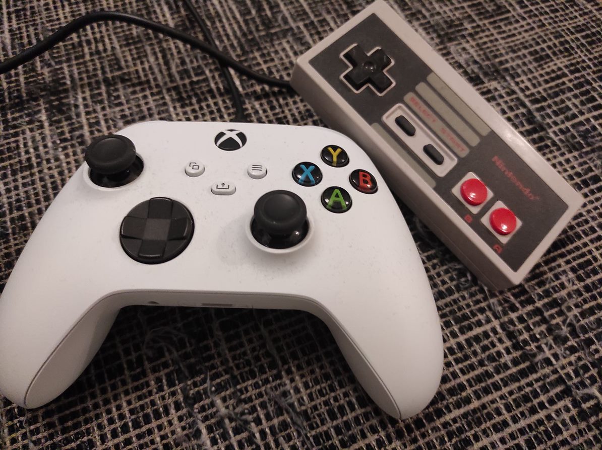
So, I decided to make a bit of a comparison between game controllers. In that featured image we have a NES controller. Now that’s about as old of a game pad as can be. Or do you remember something more older or simpler? Now, it has only buttons A and B, select, start and the directional control. There are older controllers but basically it doesn’t come much simpler than this. And look at the shape of that thing. It’s actually a piece of block with all those sharp edges.
To make this comparison as concrete as can be I chose the other game pad to be the standard Xbox Series S/X controller that I got shipped with my Xbox Series S. This controller has Y, A, X and B buttons, two thumb sticks, a button to control directions, four shoulder buttons and four more buttons. As you can notice I have acquired a cable for my controller so I don’t need to keep changing batteries all the time. This game pad is also very neat, good looking and fits in the players hand smoothly.
It is definitely simpler to play NES games. While playing Xbox Series S or X games you have lots of going on. Your ways to interact in the game is more diverse. As you might have or might have not heard there is actually a limit for things that a human being can handle at a time. That’s why all the menus in the user interface usually have limited amount of choices that the user has to make. This isn’t directly what is happening here but this gives us a view to what’s really going on as you are playing a game.
Remember those annoying selections you have to make when you make a phone call. You are given maybe three or four choices and you have to press a number corresponding to the selection. The user is unable to see the options that he or she has. So that’s an example of bad user interface design. I know this isn’t exactly what is going on but this is just an example of these psychological rules that our brains use to work.
So we have a more advanced controller here. As you can see the shape has been developed to be more friendly for the user. You have more options but also more responsibility. You have the ability to move accurately the cursor. So the thumb stick can actually replace the control of computers mouse. There has been almost thirty years and you can clearly see that things have in this matter progressed. I probably have to say that this controller is also if used so completely wireless.
One important thing I have to mention while we’re on this subject. It is important that the user can get out of the game and exit from it and maybe even pause the game for a while. Both of these controllers have this option. While using NES you can hit the right button to pause the game. When using Xbox Series S you have the option to pause and exit the game mode and kind of return to the operating system mode. You can also think about how this works with virtual reality. You definitely need a way to pause the game at any time you have to.

